11Case study / Brand
MARTECH
A new brand and website for MARTECH, a security and defense technology provider serving Egypt, the UAE, and Europe.

Introduction
Rebranding security with substance: culture, trust, and design.
MARTECH is a global provider of cutting-edge security and defense solutions, serving governments and businesses across Egypt, the United Arab Emirates, and Europe. As its offerings grew into advanced technologies like cybersecurity, AI, and robotics, MARTECH needed a modern, trustworthy brand and digital presence that reflected both its innovation and its authority.
I led the design and development of the new website and rebrand, working with two other designers. As team lead, I was the primary point of contact for all client and stakeholder communications. I built and launched the site using a WYSIWYG platform.
- Team
- Me, a UX/UI designer, and a logo designer.
- Platform
- A WYSIWYG website builder.
- Industry
- Security and defense technologies.
- Regions served
- Egypt, the United Arab Emirates, and Europe.
My Role
As team lead, my role covered:
- Team leadLed and coordinated the full website design and rebrand.
- Client liaisonThe main point of contact for the client and stakeholders.
- UX/UI designThe website’s UX and UI, alongside a second designer.
- Brand directionOversaw the visual redesign, including the logo.
- Graphic designAll the site’s graphics: iconography, layout styling, and abstract visuals.
- Build + launchBuilt and launched the site on a WYSIWYG platform.
- Responsive + accessibleA responsive, accessible design, focused on cold lead generation.
Discovery + Strategy
We began with a series of stakeholder interviews, to understand MARTECH’s goals, market positioning, and user pain points. The key objectives were:
- Resonant
- A culturally resonant, modern brand.
- Global
- Reflect the company’s innovation and global reach.
- Direct
- Cold inbound contact from prospective clients, without intermediaries.
The Brand
MARTECH’s original branding lacked the trust and sophistication the global defense market expects. After extensive research into cultural symbolism and color psychology, we established a new visual identity:
Navy & gold
- #000F29
- #2D334D
- #535D8D
- #F4AF26
Symbolizes trust, wealth, and cultural nuance across Egypt, the UAE, and Europe.
Eagle logo
A timeless, future-forward symbol of vision, power, and nobility.
Abstract imagery
Aligns with cybersecurity and AI products, where literal visuals are sensitive or unavailable.
Minimalist feel
Builds trust and clarity, supporting cold reach from international clients.
Navy stands for protection, authority, and trust, which matter especially in Middle Eastern cultures. Gold is universally linked to wealth and prestige, and it is deeply meaningful in Egypt, where gold connotes strength and protection.
Together, navy and gold evoke the feeling of a “protective hug,” a culturally resonant metaphor in Egyptian design.

The mark
A stylized eagle, chosen for its links to nobility and vision in the UAE, and to strength in global symbolism. Minimalist yet iconic, it’s designed to scale and endure across future touchpoints.

The Website
MARTECH’s work is sensitive (e.g., defense, cybersecurity, AI), so traditional imagery was limited. Instead, we chose an abstract, tech-forward look, with conceptual imagery and subtle motion to convey innovation without compromising discretion.

Clarity and conversion
- Clean navigationHome, Solutions, About, and Contact: guiding visitors to the key solution areas.
- Clear copyThe headline says what MARTECH does, in white and gold.
- Contact pointsContact Us, right under the headline: one of several contact points for cold outreach.
- Abstract imageryA glowing circuit-board padlock: tech-forward, without showing sensitive work.
We designed with an MVP mindset: clean information architecture, contact points throughout, and clear copy.
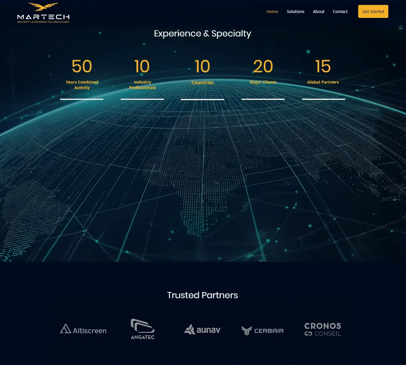
Experience and specialty
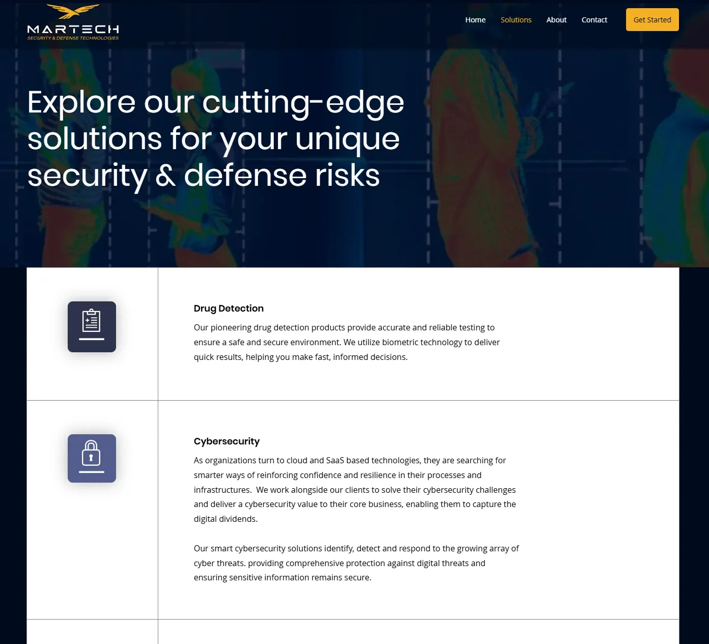
Solutions
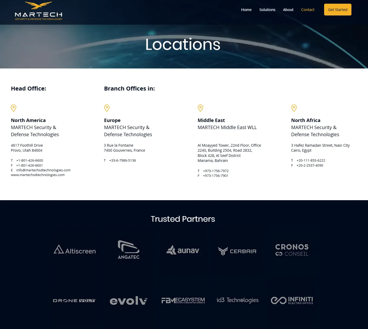
Locations


Responsive + Accessible

Built for every screen
The site was optimized for every screen size, with intuitive touchpoints.
Every section was structured with accessibility in mind: clear contrast, scalable elements, and modular layouts to future-proof the experience.
Learnings
- 01
Cultural symbolism is powerful. The emotional resonance of colors and icons can deepen a brand’s authenticity, especially in international markets.
- 02
Modernizing legacy industries. The defense sector often lags behind in design. By incorporating delight, motion, and modern UX, we carved out a competitive edge.
- 03
Design leadership is as much communication as creation. Leading this project taught me how valuable it is to balance vision, feedback, and execution across a cross-functional team.