01Case study / Product
PikMe
Content creation as a skill-based game, built for the user our research actually found: the passionate amateur, not the pro.

Introduction
PikMe turns content creation and consumption into a competitive, skill-based game.
The goal: let everyday creators earn from their work instantly, without needing followers, algorithms, or influence. As Head of Product and Game Strategist, I led PikMe from early ideation to beta: user research, system design, the game and its economy, and 3 major rounds of testing.
In 8 months, we built a category-defining product at the intersection of gaming, creator tools, and social media, where creators earn by being good, not by being known. And it launched live.


My Role
As Head of Product & Game Strategist, I:
- Vision & strategyDefined the product vision and the game strategy behind it.
- RoadmapBuilt the feature sets and prioritized the roadmap.
- ResearchDirected UX research and usability testing.
- Economy designDesigned the referral and monetization mechanics: free entries for referrals, entry fees, prize pools, payouts, and voter rewards.
- Design systemDesigned and maintained the Figma design system.
- UI/UXLed end-to-end UI/UX design, through to clickable prototypes.
- CollaborationWorked closely with engineering, brand, and legal.
Design Process
- 01
Define
Uncovered our true user, amateur Instagram creators, through 3 rounds of research and 100 user interviews.
- 02
Ideate
Brainstormed game mechanics, referral incentives, and fair monetization models, inspired by sports betting and social games.
- 03
Design
Created a scalable, WCAG-compliant design system and the high-fidelity screens.
- 04
Testing
Ran 3 full rounds of usability testing, iterated on the key flows, validated the voting experience, and ran A/B tests.
Mood boarding
- #5CFFC3
- #ACFFFF
- #FFC2DE
- #FFD059
- #3D3D3D
- Bold
- Vibrant
- Youthful
- Competition
- Creativity
- Confidence
The direction was bold, vibrant, and youthful, built on three words: competition, creativity, and confidence.
Wireframes
- Submit
- Vote
- Payout
Wireframes focused on the MVP’s core loop, the one every contest runs on: submit, vote, payout.
Scalable design system
- Typography
- Color
- Iconography
Built in Figma, with tokens for typography, color, and iconography, and designed to flex as content types expanded.
High-fidelity design
- WCAG contrast
- Vote flows
- CTAs
- Tutorials
- Wallet
Interactive screens built to WCAG-compliant contrast and sizing, with polished vote flows, CTAs, tutorials, and wallet interactions.
Prototyping
- Investor demos
- Usability testing
Clickable flows built in Figma and shared internally, for investor demos and usability testing.
The Problem
“It’s never been easier to create content, yet never been harder to monetize it.”
From a user interview
- 207M+
- Creators competing on traditional platforms
- 59%
- Of beginner creators have never monetized
On traditional platforms like Instagram and TikTok, creating is a popularity contest. Algorithms reward reach. Virality wins. Most beginners have never earned from their work, and many never will.
The vast majority of social platforms are biased toward things that have nothing to do with the work itself:
- Follower count
- Platform-savvy behavior
- Strategic post timing
- Paid promotion
We saw a massive opportunity to reframe that: a platform where the content is the only thing that counts.
The Solution
We designed a game-first approach to content. Creators enter themed contests for a small entry fee. Voters choose the winners in anonymous, head-to-head matchups. Top-voted creators earn real cash, and voters who picked the top images win rewards too, so judging well is part of the game.
- EnterA small entry fee puts a photo into a themed contest.
- VoteAnonymous, head-to-head matchups decide the ranking.
- WinTop creators earn cash, and the voters who backed them earn rewards.
- Cash outWinnings land in the wallet, ready to withdraw.
No profiles. No followers. No comment sections. Just content, skill, and community-powered results.

Understanding the Challenge
We started out assuming professional photographers (event and wildlife) would be our primary users. The research said otherwise.
- 100
- User interviews
- 3
- Major user testing rounds
Our core user wasn’t the pro. It was the amateur Instagram photographer: real passion, a great eye, and no easy way to monetize.
- Assumed
Event photographers
Hesitant about non-traditional monetization.
- Assumed
Wildlife photographers
Felt the stakes didn’t match their work.
- Core user
Amateur Instagram creators
Loved the fairness and clarity of a game.
That pivot shaped the product decisions that followed.
User Research + Discovery
Beyond interviews and usability testing, we grounded our research in the bigger conversation about where media is heading. One foundational influence was Grace Kasten’s article, The Case for a New Media Format. It helped us understand that:
“The next media format won’t be static. It will be interactive, gamified, and active.”
Grace Kasten, The Case for a New Media Format
We distilled it into three principles:
- Reward function
- Content must offer dynamic outcomes: votes, wins, and feedback.
- Predefined goals
- Structured journeys help creators build intentional content.
- Generative experiences
- Media should invite participation, not just consumption.
We embraced these ideas by building a system where every interaction (uploading, voting, winning) was part of a structured and rewarding game loop.
Competitive + Secondary Research
Traditional platforms like Instagram, TikTok, and Viewbug reinforced a performance hierarchy built on popularity metrics. Even the newer “creator economy” tools still required virality to see returns.
| PikMe | TikTok | ||
|---|---|---|---|
| Requires followers | No | Yes | Yes |
| Cash rewards | Yes | No | Yes* |
| Anonymous voting | Yes | No | No |
| Skill-based wins | Yes | No | No |
| Daily challenges | Yes | No | No |
| Game mechanics | Yes | No | Partial |
Inspired by Kasten’s vision, we saw three shifts:
- Interactive video is on the rise
- Game design is shaping the future of content
- Passive consumption is dying, replaced by “content-as-play”
We also noted the rise of:
- VR and AR experiences built around world-building
- AI tools that personalize media based on user interaction
- Social video formats that emphasize community engagement, like TikTok duets
Removing follower systems, focusing on daily interactive challenges, and building gamified reward mechanics put PikMe right in line with this shift in how media is created, consumed, and valued.
User Flows + Information Architecture
We mapped every user journey, from unregistered onboarding through to wallet withdrawal:
- Referral entry logic
- Game entry and the voting loop
- Alerts, contest results, and withdrawal flows
Then we built layered decision flowcharts for both app and web, keeping the logic scalable and modular.

Gamification Strategy
We built the core gameplay around mechanics players already know:
- Head-to-head matchups, like bracket voting
- Daily contests with jackpots
- Referral-based free entries
- Leaderboards and ranking systems
- Tutorials and unlockable challenges
Play, win, share.
The loop every interaction reinforces

Usability Testing + Iteration
Across 3 major test rounds, we refined:
- Language, from “submit” to “compete”
- Flow clarity, with more progress indicators
- Tutorials, with first-time voting simplified
- Game feedback, with real-time animations for votes
We made accessibility a priority:
- Designed for one-handed mobile use
- WCAG color contrast compliance
- Readable fonts, and alt text for future expansion
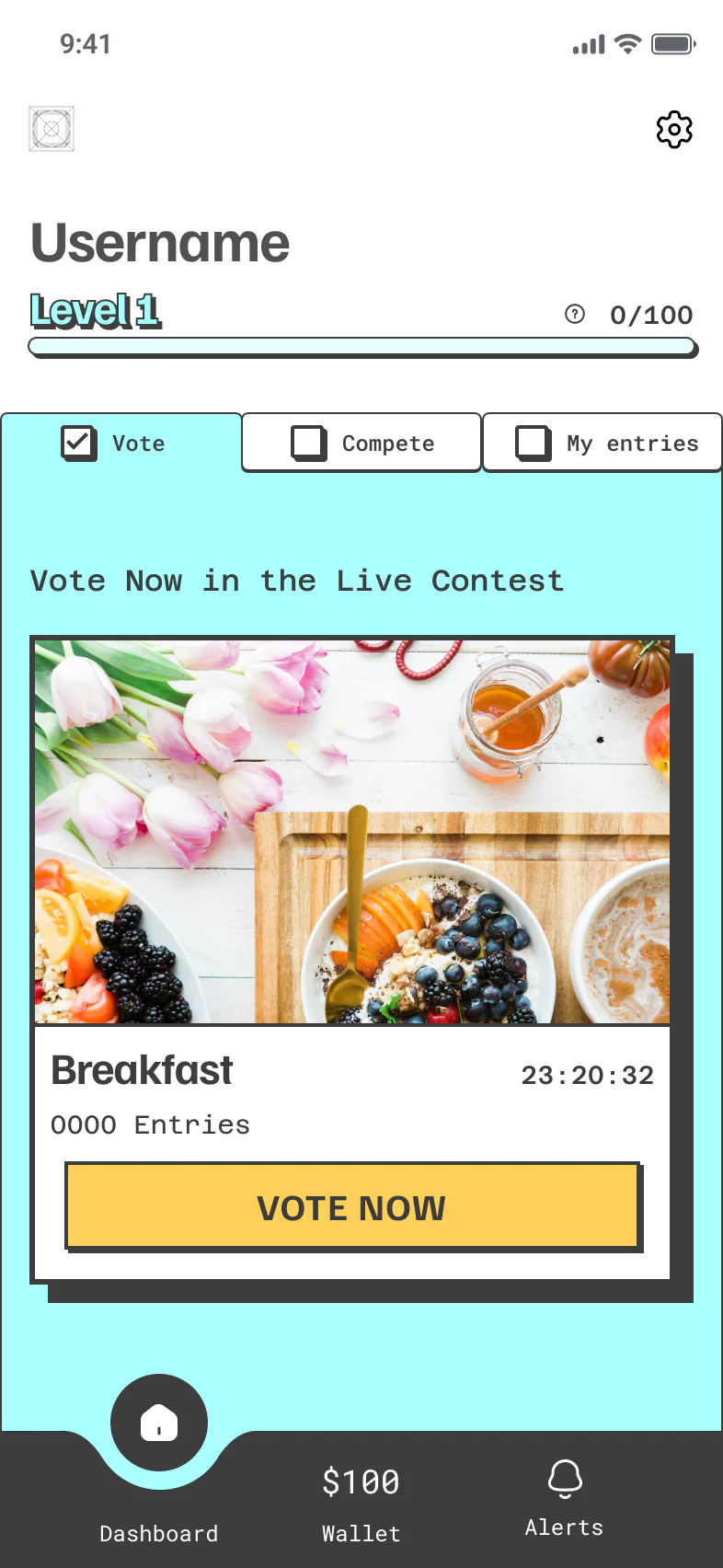
Round 1Key findings
- Top navigation
Users struggled to reach the navigation bars at the top of the screen: they sat outside the thumb zone.
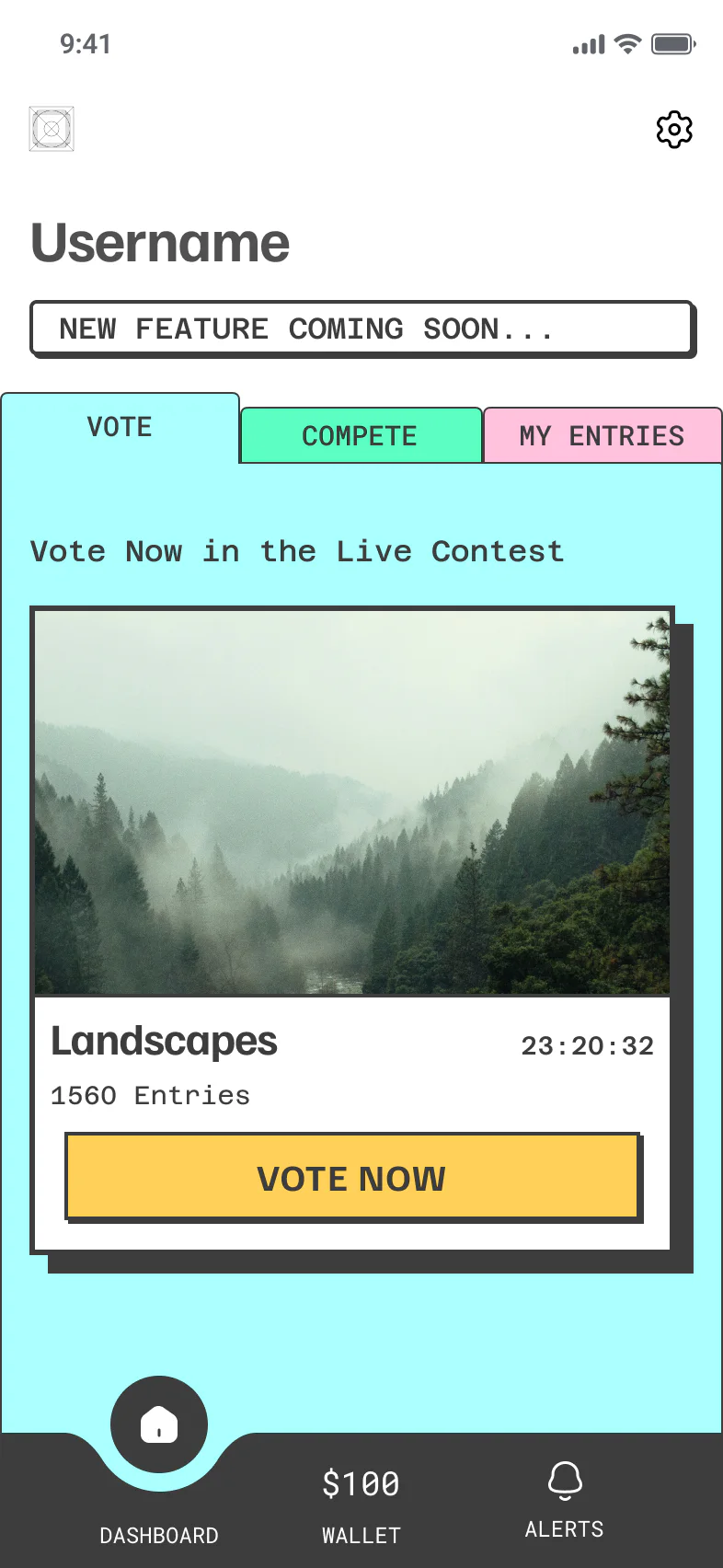
Round 2Key findings
- Top navigation
- Category card
The thumb-zone problem persisted in the top navigation, and users began to find the category cards unclear.
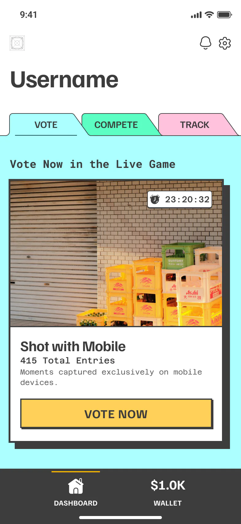
Round 3Final solutions
- Top navigation
- Card context
- Bottom nav labels
- Alerts by settings
A redesigned top navigation improved thumb reach. We added context to the category cards, gave the bottom nav clearer labels, and moved alerts next to settings.


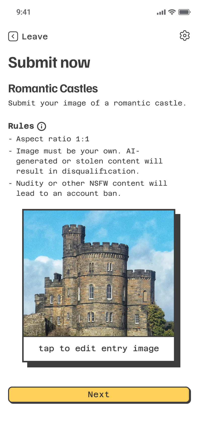
Round 1Key findings
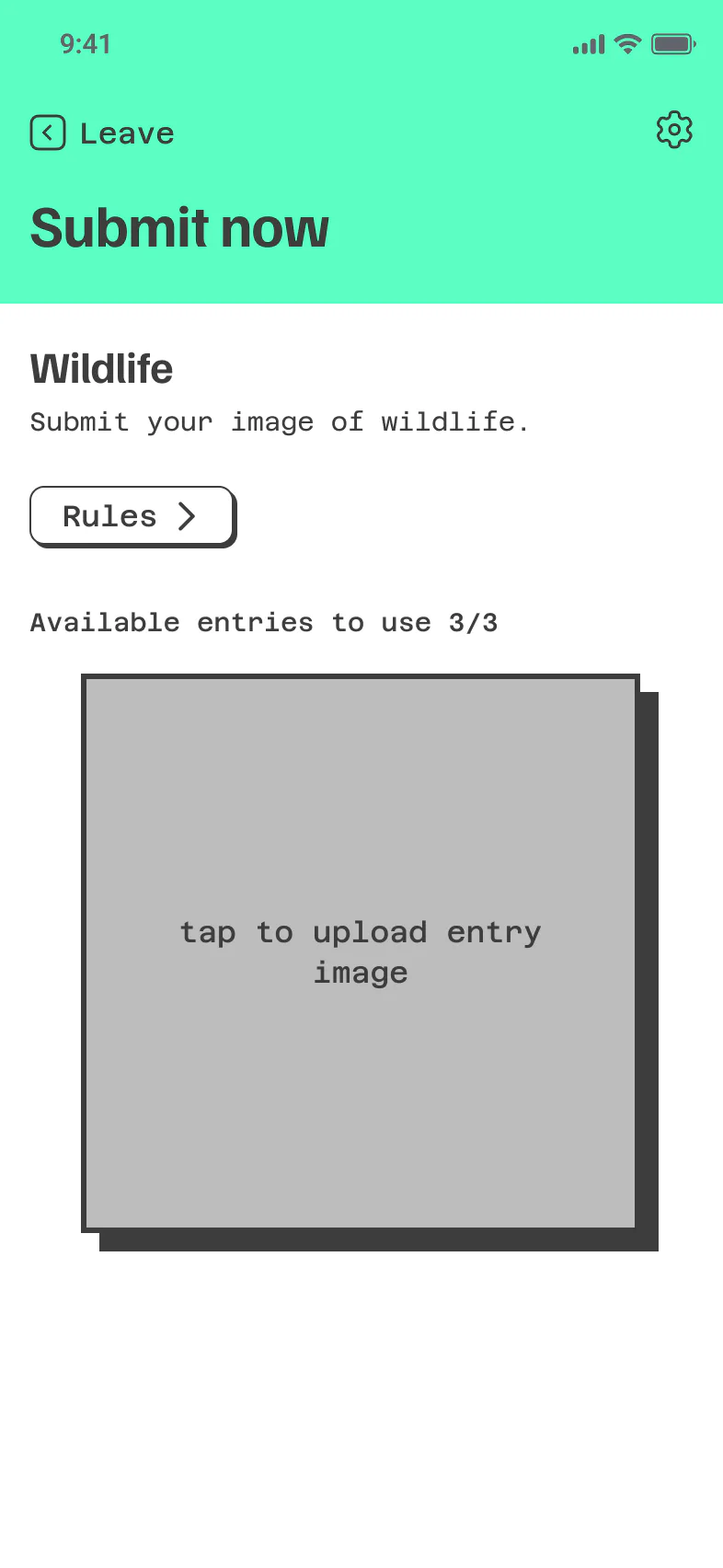
- Rules up front
Users valued seeing the rules up front, but spent more time than expected reading them and worrying about whether their photo was eligible.
Round 2Key findings
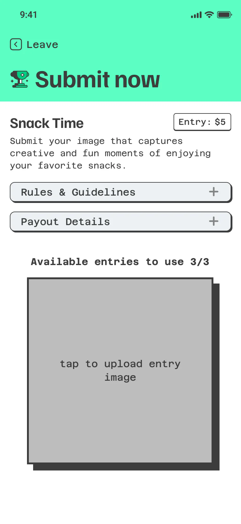
- Rules dropdown
- Entry limits
Moving the rules into a dropdown with clearer entry limits landed well, but users weren’t sure where to find the payout details or the entry cost.
Round 3Final solutions
- Payout details
- Entry cost
- Photo guidance
We added the payout details and entry costs, along with clearer guidance on what makes a strong photo submission.


A/B Testing + Ongoing Optimization
We A/B tested the language at three key moments:
- Theme naming
- Literal vs. abstract
- CTA phrasing
- “Play Now” vs. “Join the Contest”
- Wallet triggers
- “Instant Cash” vs. “Claim Your Winnings”
From there, ongoing optimization focused on two things: increasing time spent voting and improving referral conversion.
Learnings
- 01
Fair, follower-less systems are deeply appealing to emerging creators.
- 02
Game loops must be emotionally and financially motivating to drive return play.
- 03
Gamified content unlocks new monetization models.
Conclusion
PikMe redefined how creators monetize by turning content into a skill-based game. As Head of Product and Game Strategist, I led it from discovery to beta: pivoting our user focus to amateur creators, designing the economy, building a scalable design system, and embedding gamification into every interaction.
The result: a product that launched live, and a new category we coined, Gamified Media, where creativity, not clout, wins.
Rebecca took initiative at every step, always looking for ways to improve the product and make it more engaging. Her work wasn't limited to design — she deeply understood how branding, storytelling, and gamification fit into the bigger picture and used that to shape a better user experience.