4C Logo Redesign
4C is a sports betting platform focused on prediction, forecasting, and next-gen betting experiences.
Services
Branding, Graphic Design, Logo Design
Services
Branding, Graphic Design, Logo Design
Services
Branding, Graphic Design, Logo Design
Tools
Figma, Procreate
Tools
Figma, Procreate
Tools
Figma, Procreate
Value
Reimaging a logo that sees the future of sports betting
Value
Reimaging a logo that sees the future of sports betting
Value
Reimaging a logo that sees the future of sports betting
Timeline
2 weeks
Timeline
2 weeks
Timeline
2 weeks
Overview
With the upcoming launch of their new product 4Cx, they approached me to create a refreshed brand logo that could visually communicate foresight, intuition, and clarity — all while feeling sleek, modern, and optimized for digital-first audiences across web, mobile, and social.
The client was particularly interested in integrating visual symbolism tied to vision and perception, referencing the idea of the “third eye,” and wanted to explore clean ways to potentially include an “X” to represent the sub-brand. The visual direction leaned into a sharp, elite, future facing aesthetic, with deep navy tones, and subtle mysticism.
Design Process
Discovery & Goals
Align the brand identity with themes of vision, clarity, and predictive insight — core to the betting experience.
Incorporate eye-inspired symbolism without becoming too literal or esoteric.
Explore an optional integration of “X” for the 4Cx sub-brand.
Maintain a minimalist, digital-native feel aligned with leading sports betting and crypto-adjacent brands.
Sketches
I began the process by exploring a wide range of visual directions in Procreate, hand-sketching 16 distinct logo concepts. These sketches explored:
Eye motifs in various forms — from anatomical to abstract
Integration of the “4C” lettering into geometric shapes
Symmetry, asymmetry, and mystical visual language
This phase allowed for freeform exploration before narrowing in on a digital execution style.

Iterations
After narrowing the direction with the client, we moved through several vector iterations in Figma, refining:
A primary logo combining “4C” with a symbolic eye form
Variants incorporating the optional X for the 4Cx product line
Light and dark theme versions to ensure clarity across use cases
Adjustments to the pupil and shape to balance mystery and clarity
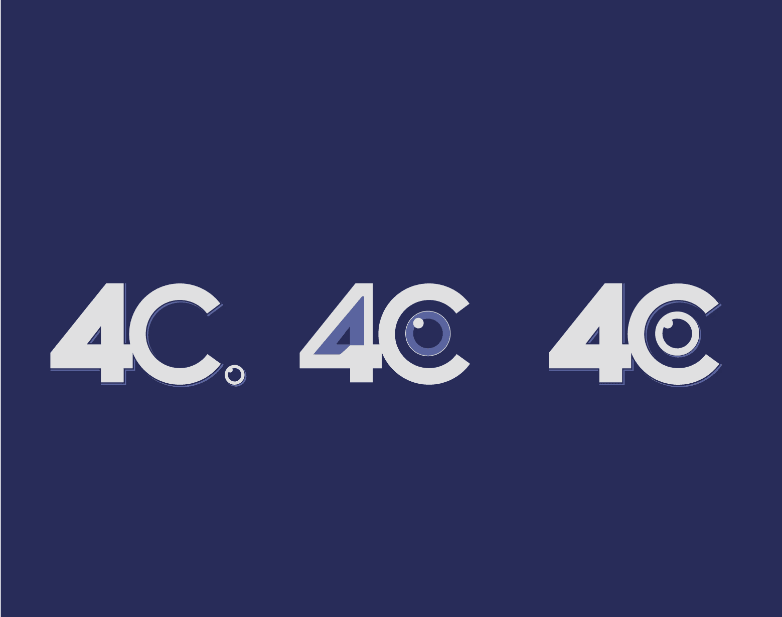
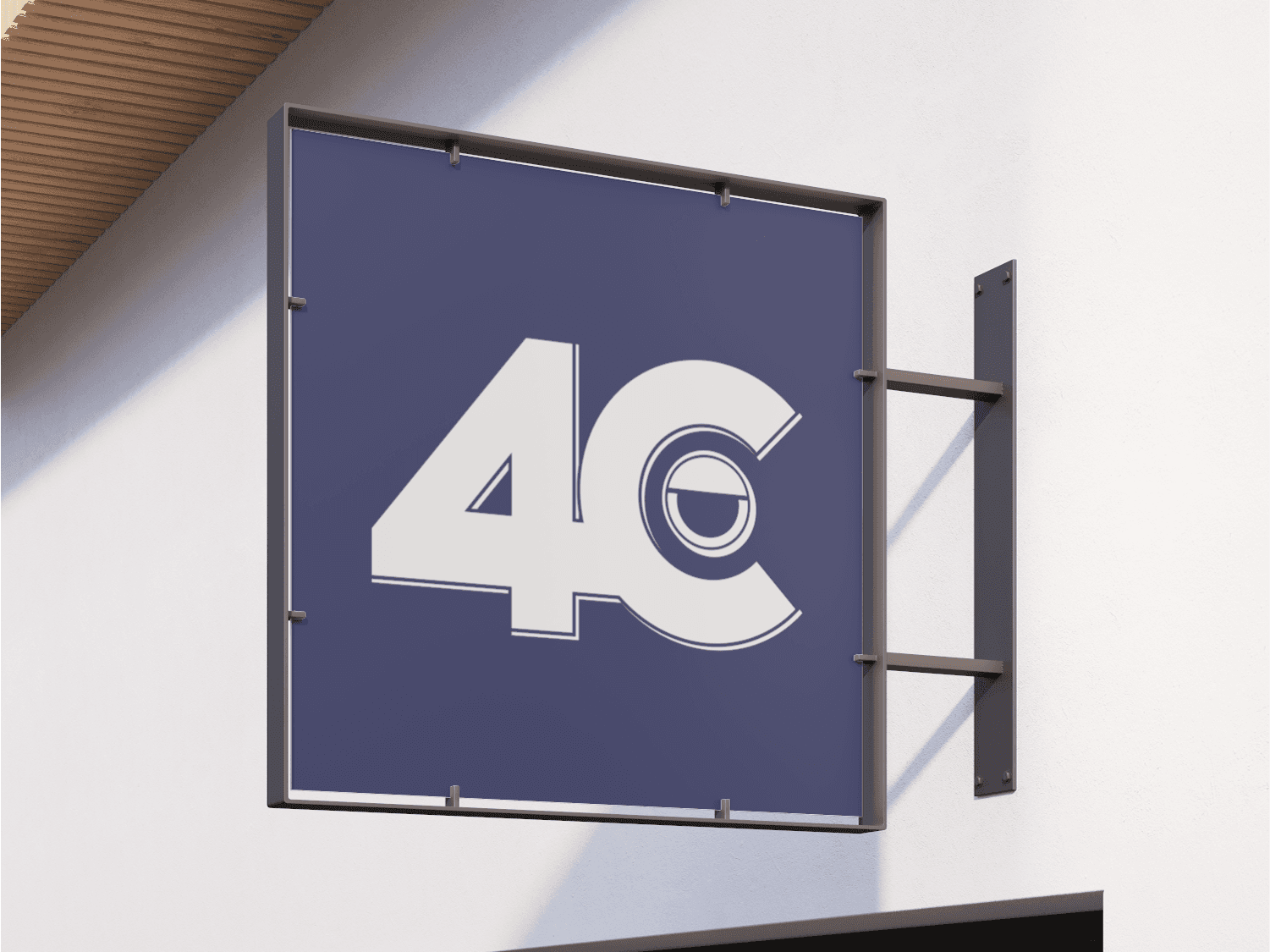
Final Logo Design
The final mark blends bold minimalism with subtle mysticism. It features:
A stylized eye shape integrated with the 4C letterforms
A “droopy eye” arc hinting at relaxed visionary awareness
A monochrome and navy-based palette pulled from the existing brand
Flexible lockups for use as a wordmark, icon, and stacked variant
The result is a logo that feels confident, modern, and built for both digital applications and brand storytelling.

Conclusion
The new 4C logo positions the brand as a bold and intelligent presence in the sports betting space — blending foresight, symbolism, and sleek usability. With scalable design elements and a clear visual signature, the identity is now ready to support the launch of 4Cx and beyond.
Conclusion
The new 4C logo positions the brand as a bold and intelligent presence in the sports betting space — blending foresight, symbolism, and sleek usability. With scalable design elements and a clear visual signature, the identity is now ready to support the launch of 4Cx and beyond.
Conclusion
The new 4C logo positions the brand as a bold and intelligent presence in the sports betting space — blending foresight, symbolism, and sleek usability. With scalable design elements and a clear visual signature, the identity is now ready to support the launch of 4Cx and beyond.
Projects
Other Projects
Other Projects


Reach out anytime
Let’s Stay Connected
Got questions or want to collaborate? Feel free to reach out—I'm open to new projects or just a casual chat!
martin.rebeccaelise@gmail.com
Reach out anytime
Let’s Stay Connected
Got questions or want to collaborate? Feel free to reach out—I'm open to new projects or just a casual chat!
martin.rebeccaelise@gmail.com
Reach out anytime
Let’s Stay Connected
Got questions or want to collaborate? Feel free to reach out—I'm open to new projects or just a casual chat!
martin.rebeccaelise@gmail.com
4C Logo Redesign
4C is a sports betting platform focused on prediction, forecasting, and next-gen betting experiences.
Services
Branding, Graphic Design, Logo Design
Services
Branding, Graphic Design, Logo Design
Services
Branding, Graphic Design, Logo Design
Tools
Figma, Procreate
Tools
Figma, Procreate
Tools
Figma, Procreate
Value
Reimaging a logo that sees the future of sports betting
Value
Reimaging a logo that sees the future of sports betting
Value
Reimaging a logo that sees the future of sports betting
Timeline
2 weeks
Timeline
2 weeks
Timeline
2 weeks
Overview
With the upcoming launch of their new product 4Cx, they approached me to create a refreshed brand logo that could visually communicate foresight, intuition, and clarity — all while feeling sleek, modern, and optimized for digital-first audiences across web, mobile, and social.
The client was particularly interested in integrating visual symbolism tied to vision and perception, referencing the idea of the “third eye,” and wanted to explore clean ways to potentially include an “X” to represent the sub-brand. The visual direction leaned into a sharp, elite, future facing aesthetic, with deep navy tones, and subtle mysticism.
Overview
With the upcoming launch of their new product 4Cx, they approached me to create a refreshed brand logo that could visually communicate foresight, intuition, and clarity — all while feeling sleek, modern, and optimized for digital-first audiences across web, mobile, and social.
The client was particularly interested in integrating visual symbolism tied to vision and perception, referencing the idea of the “third eye,” and wanted to explore clean ways to potentially include an “X” to represent the sub-brand. The visual direction leaned into a sharp, elite, future facing aesthetic, with deep navy tones, and subtle mysticism.
Overview
With the upcoming launch of their new product 4Cx, they approached me to create a refreshed brand logo that could visually communicate foresight, intuition, and clarity — all while feeling sleek, modern, and optimized for digital-first audiences across web, mobile, and social.
The client was particularly interested in integrating visual symbolism tied to vision and perception, referencing the idea of the “third eye,” and wanted to explore clean ways to potentially include an “X” to represent the sub-brand. The visual direction leaned into a sharp, elite, future facing aesthetic, with deep navy tones, and subtle mysticism.
Design Process
Discovery & Goals
Align the brand identity with themes of vision, clarity, and predictive insight — core to the betting experience.
Incorporate eye-inspired symbolism without becoming too literal or esoteric.
Explore an optional integration of “X” for the 4Cx sub-brand.
Maintain a minimalist, digital-native feel aligned with leading sports betting and crypto-adjacent brands.
Design Process
Discovery & Goals
Align the brand identity with themes of vision, clarity, and predictive insight — core to the betting experience.
Incorporate eye-inspired symbolism without becoming too literal or esoteric.
Explore an optional integration of “X” for the 4Cx sub-brand.
Maintain a minimalist, digital-native feel aligned with leading sports betting and crypto-adjacent brands.
Design Process
Discovery & Goals
Align the brand identity with themes of vision, clarity, and predictive insight — core to the betting experience.
Incorporate eye-inspired symbolism without becoming too literal or esoteric.
Explore an optional integration of “X” for the 4Cx sub-brand.
Maintain a minimalist, digital-native feel aligned with leading sports betting and crypto-adjacent brands.
Sketches
I began the process by exploring a wide range of visual directions in Procreate, hand-sketching 16 distinct logo concepts. These sketches explored:
Eye motifs in various forms — from anatomical to abstract
Integration of the “4C” lettering into geometric shapes
Symmetry, asymmetry, and mystical visual language
This phase allowed for freeform exploration before narrowing in on a digital execution style.
Sketches
I began the process by exploring a wide range of visual directions in Procreate, hand-sketching 16 distinct logo concepts. These sketches explored:
Eye motifs in various forms — from anatomical to abstract
Integration of the “4C” lettering into geometric shapes
Symmetry, asymmetry, and mystical visual language
This phase allowed for freeform exploration before narrowing in on a digital execution style.
Sketches
I began the process by exploring a wide range of visual directions in Procreate, hand-sketching 16 distinct logo concepts. These sketches explored:
Eye motifs in various forms — from anatomical to abstract
Integration of the “4C” lettering into geometric shapes
Symmetry, asymmetry, and mystical visual language
This phase allowed for freeform exploration before narrowing in on a digital execution style.
Iterations
After narrowing the direction with the client, we moved through several vector iterations in Figma, refining:
A primary logo combining “4C” with a symbolic eye form
Variants incorporating the optional X for the 4Cx product line
Light and dark theme versions to ensure clarity across use cases
Adjustments to the pupil and shape to balance mystery and clarity
Final Logo Design
The final mark blends bold minimalism with subtle mysticism. It features:
A stylized eye shape integrated with the 4C letterforms
A “droopy eye” arc hinting at relaxed visionary awareness
A monochrome and navy-based palette pulled from the existing brand
Flexible lockups for use as a wordmark, icon, and stacked variant
The result is a logo that feels confident, modern, and built for both digital applications and brand storytelling.
Conclusion
The new 4C logo positions the brand as a bold and intelligent presence in the sports betting space — blending foresight, symbolism, and sleek usability. With scalable design elements and a clear visual signature, the identity is now ready to support the launch of 4Cx and beyond.
Conclusion
The new 4C logo positions the brand as a bold and intelligent presence in the sports betting space — blending foresight, symbolism, and sleek usability. With scalable design elements and a clear visual signature, the identity is now ready to support the launch of 4Cx and beyond.
Conclusion
The new 4C logo positions the brand as a bold and intelligent presence in the sports betting space — blending foresight, symbolism, and sleek usability. With scalable design elements and a clear visual signature, the identity is now ready to support the launch of 4Cx and beyond.
Projects
Other Projects
Other Projects
Reach out anytime
Let’s Stay Connected
Got questions or want to collaborate? Feel free to reach out—I'm open to new projects or just a casual chat!
martin.rebeccaelise@gmail.com
Reach out anytime
Let’s Stay Connected
Got questions or want to collaborate? Feel free to reach out—I'm open to new projects or just a casual chat!
martin.rebeccaelise@gmail.com
Reach out anytime
Let’s Stay Connected
Got questions or want to collaborate? Feel free to reach out—I'm open to new projects or just a casual chat!
martin.rebeccaelise@gmail.com