AiR HUB @ UNLV
AIRHUB is a new research lab from the University of Nevada, Las Vegas, focused on the intersection of artificial intelligence and the gambling industry.
Services
Branding, Graphic Design, Logo Design
Services
Branding, Graphic Design, Logo Design
Services
Branding, Graphic Design, Logo Design
Tools
Figma, Procreate
Tools
Figma, Procreate
Tools
Figma, Procreate
Value
Where AI meets Gambling — advancing research on impact, risk, and opportunity
Value
Where AI meets Gambling — advancing research on impact, risk, and opportunity
Value
Where AI meets Gambling — advancing research on impact, risk, and opportunity
Timeline
4 weeks
Timeline
4 weeks
Timeline
4 weeks
Introduction
As a forward-thinking initiative within the UNLV International Gaming Institute, AIR HUB connects academic researchers, industry operators, regulators, and customers to explore the risks, opportunities, and ethical implications of AI in gambling.
The goal of this project was to create a modern, understated logo that visually communicates AIR HUB’s core mission—bridging AI, research, and gambling—without relying on clichés or overly academic symbolism. The logo needed to convey trust, innovation, and interdisciplinary connection, and be flexible enough for use across digital, print, and presentation formats.
CLICK HERE TO READ THE OFFICIAL BLOG POST
Design Process
I began with an in-depth discovery session with the AIR HUB team to understand their vision, goals, and stakeholder landscape. Key takeaways from this phase:
Mission: Advance responsible adoption of AI in gambling through interdisciplinary research.
Differentiator: A pragmatic, industry-integrated hub—not just academic, but connected.
Tone: Clean, modern, trustworthy.
Avoidances: Gambling clichés (dice, spades), shields, cartoonish logos, overly technical symbols.
Visual inspirations: Anthropic, Evident AI, Robust Intelligence, Alchemy Health.
From here, the design process focused on translating this strategy into a minimalist mark, balancing symbolism with restraint.
Sketches
Early concepts explored 22 distinct directions:
Emphasis on the R in AIRHUB (“AI Research Hub”) to convey convergence.
Venn-diagram-inspired layouts to reflect overlapping domains.
Hub-and-spoke models symbolizing interdisciplinary connection.
Typographic studies to explore personality through form.
These were hand-sketched in Procreate and reviewed for alignment with the client’s goals.

Iterations
After narrowing the direction, I created multiple digital mockups in Figma:
Variations in weight and shape of the “R”
Monogram vs. wordmark configurations
Icon-only and full logo lockups
Light/dark mode and color variants using understated accents of UNLV’s scarlet and gray
The client was especially drawn to concepts that subtly implied AI + gambling + research without being overt.

Final Result
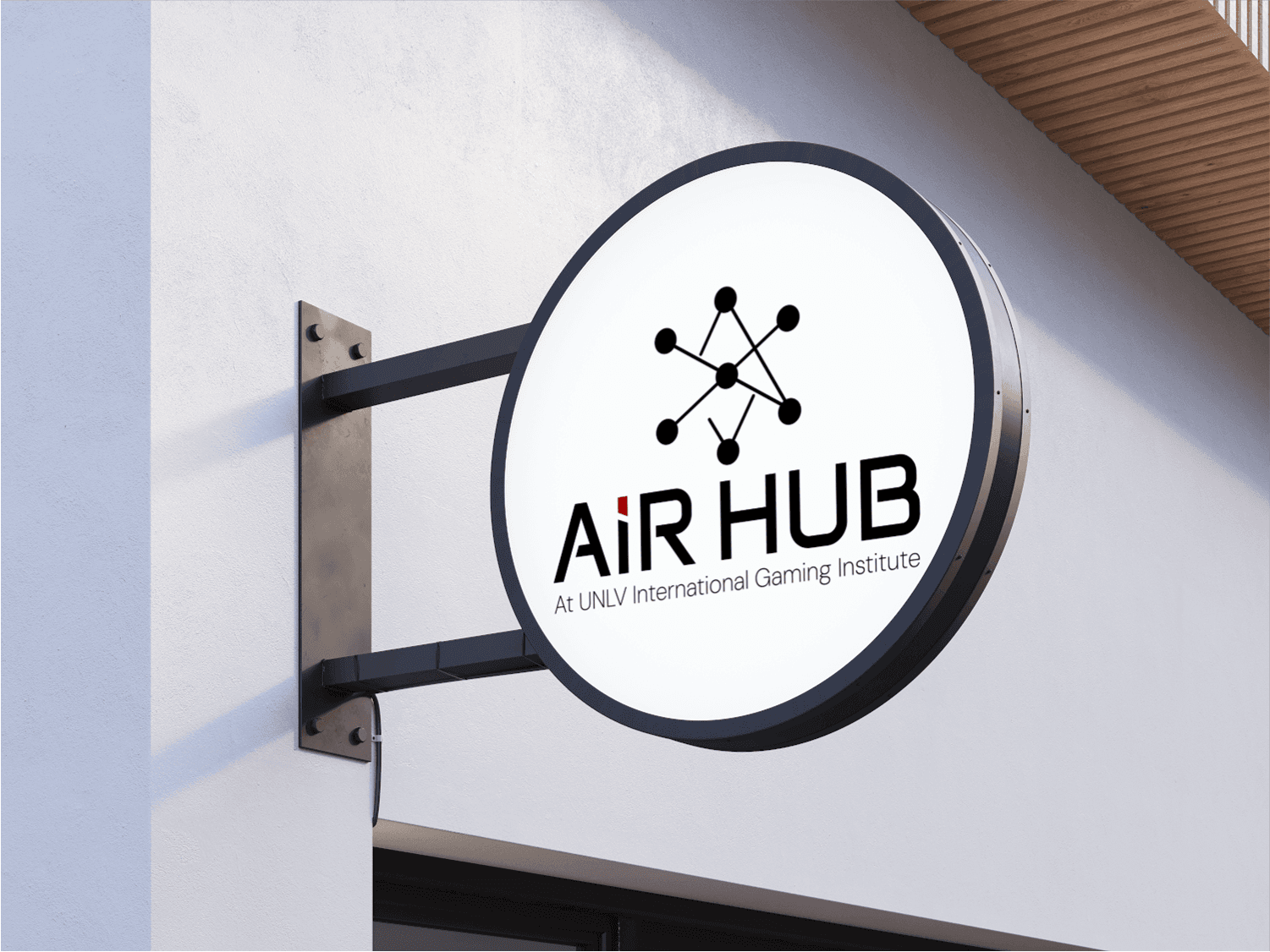
The final logo centers on a refined wordmark, with a standout emphasis on the “I” in “AI”—subtly separating “AI” from “Rhub” to visually underscore the idea of “AI meets Gambling.” The “I” acts as a quiet focal point, symbolizing AIR HUB’s role as a pillar of insight and intelligence within a complex and evolving industry.
This minimal but intentional typographic distinction allows the logo to speak to AI’s presence without relying on overused symbols. The result is a modern, understated identity that is confident, flexible, and well-suited to both academic and industry audiences.
Deliverables included:
Full wordmark logo (light/dark mode)
Icon-only version
Color, grayscale, and black & white formats
Final Result
The final logo centers on a refined wordmark, with a standout emphasis on the “I” in “AI”—subtly separating “AI” from “Rhub” to visually underscore the idea of “AI meets Gambling.” The “I” acts as a quiet focal point, symbolizing AIR HUB’s role as a pillar of insight and intelligence within a complex and evolving industry.
This minimal but intentional typographic distinction allows the logo to speak to AI’s presence without relying on overused symbols. The result is a modern, understated identity that is confident, flexible, and well-suited to both academic and industry audiences.
Deliverables included:
Full wordmark logo (light/dark mode)
Icon-only version
Color, grayscale, and black & white formats

Conclusion
The AIRHUB logo successfully captures the lab’s role as a trusted center for responsible AI research in gambling. By leaning into abstraction, typographic nuance, and thoughtful structure, the brand avoids the pitfalls of industry stereotypes while establishing a clear, confident identity aligned with UNLV’s forward-thinking legacy.

Reach out anytime
Let’s Stay Connected
Got questions or want to collaborate? Feel free to reach out—I'm open to new projects or just a casual chat!
martin.rebeccaelise@gmail.com
Reach out anytime
Let’s Stay Connected
Got questions or want to collaborate? Feel free to reach out—I'm open to new projects or just a casual chat!
martin.rebeccaelise@gmail.com
Reach out anytime
Let’s Stay Connected
Got questions or want to collaborate? Feel free to reach out—I'm open to new projects or just a casual chat!
martin.rebeccaelise@gmail.com
AiR HUB @ UNLV
AIRHUB is a new research lab from the University of Nevada, Las Vegas, focused on the intersection of artificial intelligence and the gambling industry.
Services
Branding, Graphic Design, Logo Design
Services
Branding, Graphic Design, Logo Design
Services
Branding, Graphic Design, Logo Design
Tools
Figma, Procreate
Tools
Figma, Procreate
Tools
Figma, Procreate
Value
Where AI meets Gambling — advancing research on impact, risk, and opportunity
Value
Where AI meets Gambling — advancing research on impact, risk, and opportunity
Value
Where AI meets Gambling — advancing research on impact, risk, and opportunity
Timeline
4 weeks
Timeline
4 weeks
Timeline
4 weeks
Introduction
As a forward-thinking initiative within the UNLV International Gaming Institute, AIR HUB connects academic researchers, industry operators, regulators, and customers to explore the risks, opportunities, and ethical implications of AI in gambling.
The goal of this project was to create a modern, understated logo that visually communicates AIR HUB’s core mission—bridging AI, research, and gambling—without relying on clichés or overly academic symbolism. The logo needed to convey trust, innovation, and interdisciplinary connection, and be flexible enough for use across digital, print, and presentation formats.
CLICK HERE TO READ THE OFFICIAL BLOG POST
Introduction
As a forward-thinking initiative within the UNLV International Gaming Institute, AIR HUB connects academic researchers, industry operators, regulators, and customers to explore the risks, opportunities, and ethical implications of AI in gambling.
The goal of this project was to create a modern, understated logo that visually communicates AIR HUB’s core mission—bridging AI, research, and gambling—without relying on clichés or overly academic symbolism. The logo needed to convey trust, innovation, and interdisciplinary connection, and be flexible enough for use across digital, print, and presentation formats.
CLICK HERE TO READ THE OFFICIAL BLOG POST
Introduction
As a forward-thinking initiative within the UNLV International Gaming Institute, AIR HUB connects academic researchers, industry operators, regulators, and customers to explore the risks, opportunities, and ethical implications of AI in gambling.
The goal of this project was to create a modern, understated logo that visually communicates AIR HUB’s core mission—bridging AI, research, and gambling—without relying on clichés or overly academic symbolism. The logo needed to convey trust, innovation, and interdisciplinary connection, and be flexible enough for use across digital, print, and presentation formats.
CLICK HERE TO READ THE OFFICIAL BLOG POST
Design Process
I began with an in-depth discovery session with the AIR HUB team to understand their vision, goals, and stakeholder landscape. Key takeaways from this phase:
Mission: Advance responsible adoption of AI in gambling through interdisciplinary research.
Differentiator: A pragmatic, industry-integrated hub—not just academic, but connected.
Tone: Clean, modern, trustworthy.
Avoidances: Gambling clichés (dice, spades), shields, cartoonish logos, overly technical symbols.
Visual inspirations: Anthropic, Evident AI, Robust Intelligence, Alchemy Health.
From here, the design process focused on translating this strategy into a minimalist mark, balancing symbolism with restraint.
Design Process
I began with an in-depth discovery session with the AIR HUB team to understand their vision, goals, and stakeholder landscape. Key takeaways from this phase:
Mission: Advance responsible adoption of AI in gambling through interdisciplinary research.
Differentiator: A pragmatic, industry-integrated hub—not just academic, but connected.
Tone: Clean, modern, trustworthy.
Avoidances: Gambling clichés (dice, spades), shields, cartoonish logos, overly technical symbols.
Visual inspirations: Anthropic, Evident AI, Robust Intelligence, Alchemy Health.
From here, the design process focused on translating this strategy into a minimalist mark, balancing symbolism with restraint.
Design Process
I began with an in-depth discovery session with the AIR HUB team to understand their vision, goals, and stakeholder landscape. Key takeaways from this phase:
Mission: Advance responsible adoption of AI in gambling through interdisciplinary research.
Differentiator: A pragmatic, industry-integrated hub—not just academic, but connected.
Tone: Clean, modern, trustworthy.
Avoidances: Gambling clichés (dice, spades), shields, cartoonish logos, overly technical symbols.
Visual inspirations: Anthropic, Evident AI, Robust Intelligence, Alchemy Health.
From here, the design process focused on translating this strategy into a minimalist mark, balancing symbolism with restraint.
Sketches
Early concepts explored 22 distinct directions:
Emphasis on the R in AIRHUB (“AI Research Hub”) to convey convergence.
Venn-diagram-inspired layouts to reflect overlapping domains.
Hub-and-spoke models symbolizing interdisciplinary connection.
Typographic studies to explore personality through form.
These were hand-sketched in Procreate and reviewed for alignment with the client’s goals.
Sketches
Early concepts explored 22 distinct directions:
Emphasis on the R in AIRHUB (“AI Research Hub”) to convey convergence.
Venn-diagram-inspired layouts to reflect overlapping domains.
Hub-and-spoke models symbolizing interdisciplinary connection.
Typographic studies to explore personality through form.
These were hand-sketched in Procreate and reviewed for alignment with the client’s goals.
Sketches
Early concepts explored 22 distinct directions:
Emphasis on the R in AIRHUB (“AI Research Hub”) to convey convergence.
Venn-diagram-inspired layouts to reflect overlapping domains.
Hub-and-spoke models symbolizing interdisciplinary connection.
Typographic studies to explore personality through form.
These were hand-sketched in Procreate and reviewed for alignment with the client’s goals.
Iterations
After narrowing the direction, I created multiple digital mockups in Figma:
Variations in weight and shape of the “R”
Monogram vs. wordmark configurations
Icon-only and full logo lockups
Light/dark mode and color variants using understated accents of UNLV’s scarlet and gray
The client was especially drawn to concepts that subtly implied AI + gambling + research without being overt.
Final Result
The final logo centers on a refined wordmark, with a standout emphasis on the “I” in “AI”—subtly separating “AI” from “Rhub” to visually underscore the idea of “AI meets Gambling.” The “I” acts as a quiet focal point, symbolizing AIR HUB’s role as a pillar of insight and intelligence within a complex and evolving industry.
This minimal but intentional typographic distinction allows the logo to speak to AI’s presence without relying on overused symbols. The result is a modern, understated identity that is confident, flexible, and well-suited to both academic and industry audiences.
Deliverables included:
Full wordmark logo (light/dark mode)
Icon-only version
Color, grayscale, and black & white formats
Conclusion
The AIRHUB logo successfully captures the lab’s role as a trusted center for responsible AI research in gambling. By leaning into abstraction, typographic nuance, and thoughtful structure, the brand avoids the pitfalls of industry stereotypes while establishing a clear, confident identity aligned with UNLV’s forward-thinking legacy.
Reach out anytime
Let’s Stay Connected
Got questions or want to collaborate? Feel free to reach out—I'm open to new projects or just a casual chat!
martin.rebeccaelise@gmail.com
Reach out anytime
Let’s Stay Connected
Got questions or want to collaborate? Feel free to reach out—I'm open to new projects or just a casual chat!
martin.rebeccaelise@gmail.com
Reach out anytime
Let’s Stay Connected
Got questions or want to collaborate? Feel free to reach out—I'm open to new projects or just a casual chat!
martin.rebeccaelise@gmail.com