McQ Autumn Campaign (2015)
In 2015, I joined Alexander McQueen as a freelance Brand Designer, working on a seasonal campaign for McQ, the brand’s former diffusion line.
Services
Branding, Design Systems
Services
Branding, Design Systems
Services
Branding, Design Systems
Tools
Adobe Creative Suite
Tools
Adobe Creative Suite
Tools
Adobe Creative Suite
Value
Elevating the rebellious: Reimagining Alexander McQueen’s diffusion line for the French market
Value
Elevating the rebellious: Reimagining Alexander McQueen’s diffusion line for the French market
Value
Elevating the rebellious: Reimagining Alexander McQueen’s diffusion line for the French market
Timeline
3 months
Timeline
3 months
Timeline
3 months
The Context
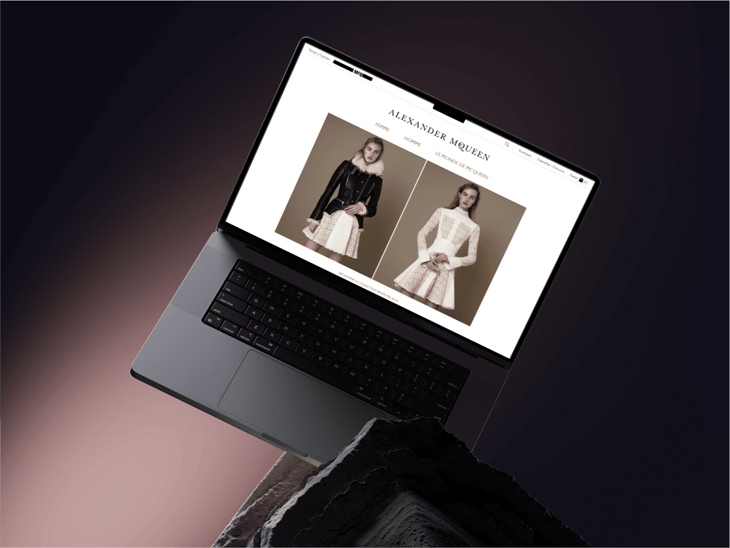
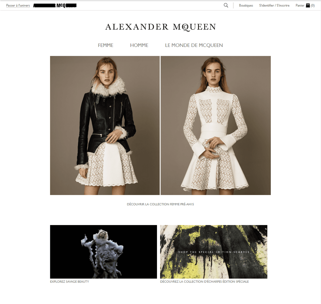
In 2015, I joined Alexander McQueen as a freelance Brand Designer, collaborating with a small design team on a seasonal campaign for McQ—the brand’s now-retired, more affordable line. McQ was known for its raw, youth-driven, rock-inspired aesthetic, offering a more accessible entry point into the McQueen world without losing its edge.
The project focused on McQ’s Autumn campaign for the French market, during a pivotal moment: the parent company was exploring ways to elevate McQ’s visual identity and subtly introduce higher-end product tiers. The result needed to feel cleaner, more refined—yet still unmistakably McQ.
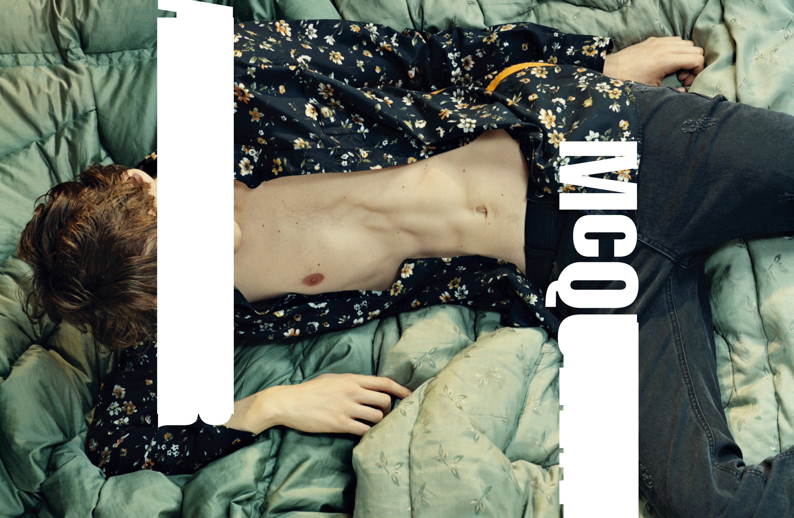
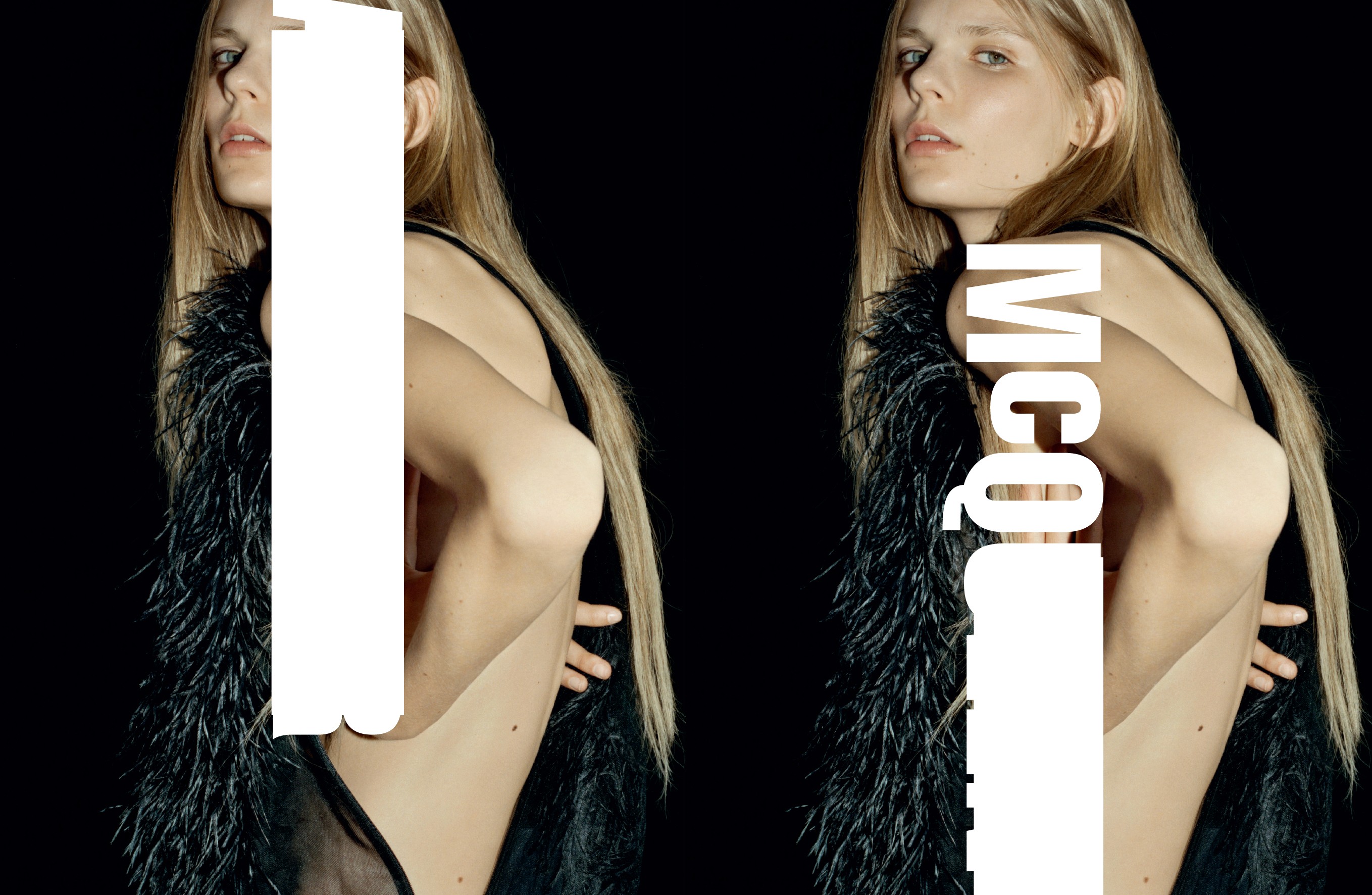
Note: Due to NDA restrictions, only limited visuals from this project are included. This case study focuses primarily on the design thinking and strategic process behind the work.
The Context
In 2015, I joined Alexander McQueen as a freelance Brand Designer, collaborating with a small design team on a seasonal campaign for McQ—the brand’s now-retired, more affordable line. McQ was known for its raw, youth-driven, rock-inspired aesthetic, offering a more accessible entry point into the McQueen world without losing its edge.
The project focused on McQ’s Autumn campaign for the French market, during a pivotal moment: the parent company was exploring ways to elevate McQ’s visual identity and subtly introduce higher-end product tiers. The result needed to feel cleaner, more refined—yet still unmistakably McQ.
Note: Due to NDA restrictions, only limited visuals from this project are included. This case study focuses primarily on the design thinking and strategic process behind the work.
My Role
As a Brand Designer, I was responsible for:
Defining and applying the visual identity across all campaign materials
Ensuring consistency across web, in-store, and print collateral
Co-creating regional brand guidelines for the French market
Aligning visual decisions with the broader Alexander McQueen brand system while maintaining McQ’s distinct tone
The Challenge
Previous McQ campaigns leaned heavily into grunge aesthetics—dark palettes, distressed fonts, and bold layouts. But for this campaign, there was a strategic shift: we needed to appeal to the French market’s preference for visual clarity and sophistication, while also reinforcing McQ’s place in the McQueen ecosystem.
The creative tension was clear: how do you create a campaign that feels classic, clean, and high-end without erasing the raw energy that defined McQ?
My Approach
I focused on evolving—not overhauling—the brand’s expression. Here’s how I approached it:
1. Adapting Typography from the Main Line
We incorporated refined serif elements from Alexander McQueen’s primary luxury identity, pairing them with custom, grittier touches to preserve McQ’s rock-inspired attitude. This created a subtle bridge between the two brands.
2. Building Cohesive Regional Guidelines
I led the creation of a regional brand system specific to France. These guidelines standardized typography, color palette, logo placement, and usage across all French-facing materials—and remained in use through future campaigns until McQ’s discontinuation in 2022.
3. Ensuring Multi-Channel Consistency
I collaborated closely across teams to ensure the campaign identity was applied consistently across digital (web, emails), in-store (point of sale, signage), and printed marketing collateral. Every element had to feel unified, whether someone encountered the campaign online or walking past a storefront in Paris.
Design Decisions That Mattered
Color Palette: Shifted away from heavy blacks toward muted neutrals and cool metallics to modernize the tone without losing the edge
Visual Hierarchy: Simplified layout structure for greater visual skimmability, especially important in French print media
Tone & Mood: Replaced grunge with restraint—what we called “quiet rebellion”—a look that captured the shift toward more premium positioning while staying emotionally aligned with McQ’s DNA
The Outcome
The Autumn campaign successfully introduced a new level of visual polish to McQ, resonating with the French audience while setting a new tone for the brand’s evolution. While much of the work remains under NDA, the visual system and guidelines I helped create were adopted for future French campaigns and used consistently until McQ was sunset in 2022.
Reflection
This project taught me how to navigate the tension between legacy and evolution. It wasn’t about reinventing McQ—it was about helping it grow up without losing its voice. I learned how to translate global luxury cues into regionally appropriate design, and how to guide a brand through visual change without compromising its identity.


Reach out anytime
Let’s Stay Connected
Got questions or want to collaborate? Feel free to reach out—I'm open to new projects or just a casual chat!
martin.rebeccaelise@gmail.com
Reach out anytime
Let’s Stay Connected
Got questions or want to collaborate? Feel free to reach out—I'm open to new projects or just a casual chat!
martin.rebeccaelise@gmail.com
Reach out anytime
Let’s Stay Connected
Got questions or want to collaborate? Feel free to reach out—I'm open to new projects or just a casual chat!
martin.rebeccaelise@gmail.com
McQ Autumn Campaign (2015)
In 2015, I joined Alexander McQueen as a freelance Brand Designer, working on a seasonal campaign for McQ, the brand’s former diffusion line.
Services
Branding, Design Systems
Services
Branding, Design Systems
Services
Branding, Design Systems
Tools
Adobe Creative Suite
Tools
Adobe Creative Suite
Tools
Adobe Creative Suite
Value
Elevating the rebellious: Reimagining Alexander McQueen’s diffusion line for the French market
Value
Elevating the rebellious: Reimagining Alexander McQueen’s diffusion line for the French market
Value
Elevating the rebellious: Reimagining Alexander McQueen’s diffusion line for the French market
Timeline
3 months
Timeline
3 months
Timeline
3 months
The Context
In 2015, I joined Alexander McQueen as a freelance Brand Designer, collaborating with a small design team on a seasonal campaign for McQ—the brand’s now-retired, more affordable line. McQ was known for its raw, youth-driven, rock-inspired aesthetic, offering a more accessible entry point into the McQueen world without losing its edge.
The project focused on McQ’s Autumn campaign for the French market, during a pivotal moment: the parent company was exploring ways to elevate McQ’s visual identity and subtly introduce higher-end product tiers. The result needed to feel cleaner, more refined—yet still unmistakably McQ.
Note: Due to NDA restrictions, only limited visuals from this project are included. This case study focuses primarily on the design thinking and strategic process behind the work.
My Role
As a Brand Designer, I was responsible for:
Defining and applying the visual identity across all campaign materials
Ensuring consistency across web, in-store, and print collateral
Co-creating regional brand guidelines for the French market
Aligning visual decisions with the broader Alexander McQueen brand system while maintaining McQ’s distinct tone
The Challenge
Previous McQ campaigns leaned heavily into grunge aesthetics—dark palettes, distressed fonts, and bold layouts. But for this campaign, there was a strategic shift: we needed to appeal to the French market’s preference for visual clarity and sophistication, while also reinforcing McQ’s place in the McQueen ecosystem.
The creative tension was clear: how do you create a campaign that feels classic, clean, and high-end without erasing the raw energy that defined McQ?
My Approach
I focused on evolving—not overhauling—the brand’s expression. Here’s how I approached it:
1. Adapting Typography from the Main Line
We incorporated refined serif elements from Alexander McQueen’s primary luxury identity, pairing them with custom, grittier touches to preserve McQ’s rock-inspired attitude. This created a subtle bridge between the two brands.
2. Building Cohesive Regional Guidelines
I led the creation of a regional brand system specific to France. These guidelines standardized typography, color palette, logo placement, and usage across all French-facing materials—and remained in use through future campaigns until McQ’s discontinuation in 2022.
3. Ensuring Multi-Channel Consistency
I collaborated closely across teams to ensure the campaign identity was applied consistently across digital (web, emails), in-store (point of sale, signage), and printed marketing collateral. Every element had to feel unified, whether someone encountered the campaign online or walking past a storefront in Paris.
Design Decisions That Mattered
Color Palette: Shifted away from heavy blacks toward muted neutrals and cool metallics to modernize the tone without losing the edge
Visual Hierarchy: Simplified layout structure for greater visual skimmability, especially important in French print media
Tone & Mood: Replaced grunge with restraint—what we called “quiet rebellion”—a look that captured the shift toward more premium positioning while staying emotionally aligned with McQ’s DNA
The Outcome
The Autumn campaign successfully introduced a new level of visual polish to McQ, resonating with the French audience while setting a new tone for the brand’s evolution. While much of the work remains under NDA, the visual system and guidelines I helped create were adopted for future French campaigns and used consistently until McQ was sunset in 2022.
Reflection
This project taught me how to navigate the tension between legacy and evolution. It wasn’t about reinventing McQ—it was about helping it grow up without losing its voice. I learned how to translate global luxury cues into regionally appropriate design, and how to guide a brand through visual change without compromising its identity.
Reach out anytime
Let’s Stay Connected
Got questions or want to collaborate? Feel free to reach out—I'm open to new projects or just a casual chat!
martin.rebeccaelise@gmail.com
Reach out anytime
Let’s Stay Connected
Got questions or want to collaborate? Feel free to reach out—I'm open to new projects or just a casual chat!
martin.rebeccaelise@gmail.com
Reach out anytime
Let’s Stay Connected
Got questions or want to collaborate? Feel free to reach out—I'm open to new projects or just a casual chat!
martin.rebeccaelise@gmail.com