Netflix
Addressing inconsistencies between Netflix's "My List" feature on mobile and desktop platforms.
Services
UX/UI Design, App Design, Web Design, UX Research
Services
UX/UI Design, App Design, Web Design, UX Research
Services
UX/UI Design, App Design, Web Design, UX Research
Tools
Figma, Miro
Tools
Figma, Miro
Tools
Figma, Miro
Value
"My Netflix Redesign" – Unifying Streaming Experiences
Value
"My Netflix Redesign" – Unifying Streaming Experiences
Value
"My Netflix Redesign" – Unifying Streaming Experiences
Timeline
1 week
Timeline
1 week
Timeline
1 week

Introduction
Driven by the aspiration to provide a unified and cohesive user experience, the initiative to enhance the "My List" feature unfolded. The focus was on resolving disparities between mobile and desktop platforms, ultimately leading to the conceptualisation of "My Netflix" across all platforms.
My Role: Conception, Research, User Experience Design, User Interface Design
Design Process: Agile and Iterative
The agile design process was executed iteratively, guided by insights from user studies, heuristic evaluations, and comprehensive secondary research.
Research
In-depth exploration of industry trends, Netflix updates, and user behaviour studies illuminated the need for a more user-centric approach. This discovery laid the groundwork for a design that transcends borders, catering to diverse user needs globally.
User Insights: Understanding user preferences and challenges played a pivotal role:
Last Viewed Content: Users expressed a common desire for quicker access to their last-viewed content.
“My List”: While users valued the convenience of "My List," there was a longing for enhanced customization.
Navigation: As content lists expanded, navigation complexities increased, posing a challenge.
User Profile for "Samantha"
Content Preferences: A daily user with diverse content preferences seeking a seamless streaming experience.
Lost In Content: Desires an efficient way to quickly find and watch the last-viewed content without getting lost in an expanding list.
User Profile for "Samantha"
Content Preferences: A daily user with diverse content preferences seeking a seamless streaming experience.
Lost In Content: Desires an efficient way to quickly find and watch the last-viewed content without getting lost in an expanding list.
User Profile for "Samantha"
Content Preferences: A daily user with diverse content preferences seeking a seamless streaming experience.
Lost In Content: Desires an efficient way to quickly find and watch the last-viewed content without getting lost in an expanding list.

The Problem
1. Unified Design: Users sought a unified design across mobile and desktop platforms, prioritizing recognition over recall for a more intuitive experience.
2. Filter Quickly: Users desired swift access to their media, emphasizing the need for robust customization in content filtering.
The Solution
The redesign aimed to address these challenges by implementing responsive design principles, enhancing navigation, system status visibility, and content organization. The focus was on creating a user-friendly and efficient streaming journey.
Conceptual Shift: "My Netflix"
The redesign introduced the concept of "My Netflix" to unify the user experience. This transformed the feature into a centralized hub, elevating its significance in users' viewing experiences globally.
How Might We Statements
Content Organization: How might we enhance content organization within "My List" to cater to diverse user preferences?
Streamline Navigation: How might we streamline navigation as users’ content lists expand over time?
Last Viewed Content" How might we facilitate swift access to a user’s last-viewed content, minimizing search efforts?
User Flow
A detailed user flow, created using Miro, identified pain points in Samantha’s journey within “My Netflix” and opportunities for improvement as well as guiding the selection and design of a Minimum Viable Product (MVP). The process ensured a streamlined and user-centric approach to the redesign.
Wireframes
Low-fidelity wireframes in Figma ensured adaptability across devices, aligning with responsive design principles. Iterative loops with user insights refined the design for various interfaces.
Responsive Design Simplified
Flexibility: Ensured a consistent user experience across varying screen sizes.
Fluid Grids: Implemented grids dynamically adjusting to screen sizes, maintaining pixel-perfect layouts.

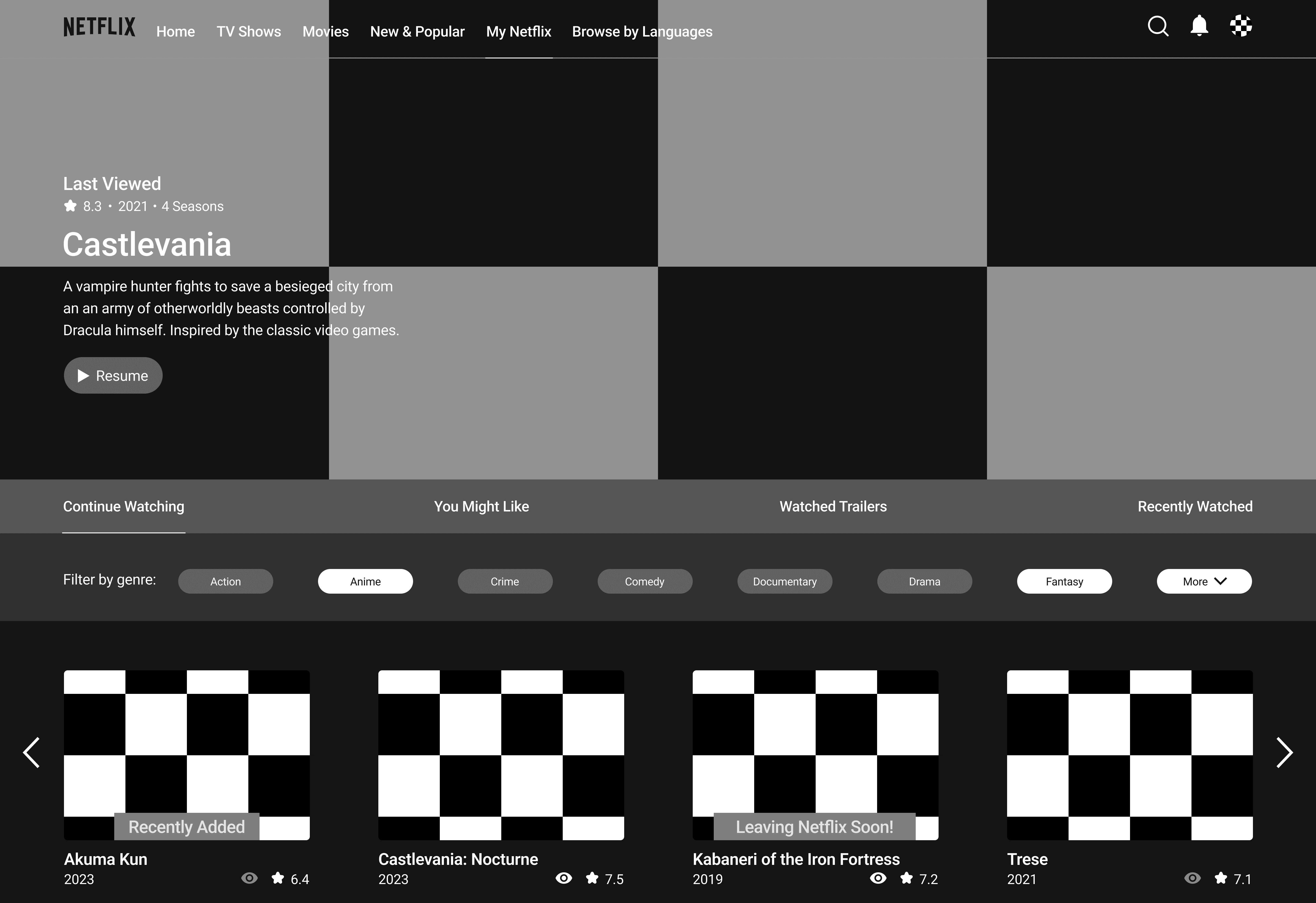
High-Fidelity Design
The final design, displayed across diverse devices, adhered to Netflix's brand language while integrating responsive carousels and a flexible filter system. The fluid grid concept guaranteed a consistent and responsive layout.
Wrap Up
"My Netflix" showcases a commitment to user-centric design by addressing key issues in the original "My List" feature, focusing on improved navigation and content organization. Challenges in the original design, including a lack of unified experience and limited filtering options, hindered user customization. The next phase involves usability testing to refine the design based on user feedback, continuing the commitment to enhancing the global streaming experience.


Reach out anytime
Let’s Stay Connected
Got questions or want to collaborate? Feel free to reach out—I'm open to new projects or just a casual chat!
martin.rebeccaelise@gmail.com
Reach out anytime
Let’s Stay Connected
Got questions or want to collaborate? Feel free to reach out—I'm open to new projects or just a casual chat!
martin.rebeccaelise@gmail.com
Reach out anytime
Let’s Stay Connected
Got questions or want to collaborate? Feel free to reach out—I'm open to new projects or just a casual chat!
martin.rebeccaelise@gmail.com
Netflix
Addressing inconsistencies between Netflix's "My List" feature on mobile and desktop platforms.
Services
UX/UI Design, App Design, Web Design, UX Research
Services
UX/UI Design, App Design, Web Design, UX Research
Services
UX/UI Design, App Design, Web Design, UX Research
Tools
Figma, Miro
Tools
Figma, Miro
Tools
Figma, Miro
Value
"My Netflix Redesign" – Unifying Streaming Experiences
Value
"My Netflix Redesign" – Unifying Streaming Experiences
Value
"My Netflix Redesign" – Unifying Streaming Experiences
Timeline
1 week
Timeline
1 week
Timeline
1 week
Introduction
Driven by the aspiration to provide a unified and cohesive user experience, the initiative to enhance the "My List" feature unfolded. The focus was on resolving disparities between mobile and desktop platforms, ultimately leading to the conceptualisation of "My Netflix" across all platforms.
My Role: Conception, Research, User Experience Design, User Interface Design
Design Process: Agile and Iterative
The agile design process was executed iteratively, guided by insights from user studies, heuristic evaluations, and comprehensive secondary research.
Research
In-depth exploration of industry trends, Netflix updates, and user behaviour studies illuminated the need for a more user-centric approach. This discovery laid the groundwork for a design that transcends borders, catering to diverse user needs globally.
User Insights: Understanding user preferences and challenges played a pivotal role:
Last Viewed Content: Users expressed a common desire for quicker access to their last-viewed content.
“My List”: While users valued the convenience of "My List," there was a longing for enhanced customization.
Navigation: As content lists expanded, navigation complexities increased, posing a challenge.
User Profile for "Samantha"
Content Preferences: A daily user with diverse content preferences seeking a seamless streaming experience.
Lost In Content: Desires an efficient way to quickly find and watch the last-viewed content without getting lost in an expanding list.
User Profile for "Samantha"
Content Preferences: A daily user with diverse content preferences seeking a seamless streaming experience.
Lost In Content: Desires an efficient way to quickly find and watch the last-viewed content without getting lost in an expanding list.
User Profile for "Samantha"
Content Preferences: A daily user with diverse content preferences seeking a seamless streaming experience.
Lost In Content: Desires an efficient way to quickly find and watch the last-viewed content without getting lost in an expanding list.
The Problem
1. Unified Design: Users sought a unified design across mobile and desktop platforms, prioritizing recognition over recall for a more intuitive experience.
2. Filter Quickly: Users desired swift access to their media, emphasizing the need for robust customization in content filtering.
The Solution
The redesign aimed to address these challenges by implementing responsive design principles, enhancing navigation, system status visibility, and content organization. The focus was on creating a user-friendly and efficient streaming journey.
Conceptual Shift: "My Netflix"
The redesign introduced the concept of "My Netflix" to unify the user experience. This transformed the feature into a centralized hub, elevating its significance in users' viewing experiences globally.
How Might We Statements
Content Organization: How might we enhance content organization within "My List" to cater to diverse user preferences?
Streamline Navigation: How might we streamline navigation as users’ content lists expand over time?
Last Viewed Content" How might we facilitate swift access to a user’s last-viewed content, minimizing search efforts?
User Flow
A detailed user flow, created using Miro, identified pain points in Samantha’s journey within “My Netflix” and opportunities for improvement as well as guiding the selection and design of a Minimum Viable Product (MVP). The process ensured a streamlined and user-centric approach to the redesign.
Wireframes
Low-fidelity wireframes in Figma ensured adaptability across devices, aligning with responsive design principles. Iterative loops with user insights refined the design for various interfaces.
Responsive Design Simplified
Flexibility: Ensured a consistent user experience across varying screen sizes.
Fluid Grids: Implemented grids dynamically adjusting to screen sizes, maintaining pixel-perfect layouts.
High-Fidelity Design
The final design, displayed across diverse devices, adhered to Netflix's brand language while integrating responsive carousels and a flexible filter system. The fluid grid concept guaranteed a consistent and responsive layout.
Wrap Up
"My Netflix" showcases a commitment to user-centric design by addressing key issues in the original "My List" feature, focusing on improved navigation and content organization. Challenges in the original design, including a lack of unified experience and limited filtering options, hindered user customization. The next phase involves usability testing to refine the design based on user feedback, continuing the commitment to enhancing the global streaming experience.
Reach out anytime
Let’s Stay Connected
Got questions or want to collaborate? Feel free to reach out—I'm open to new projects or just a casual chat!
martin.rebeccaelise@gmail.com
Reach out anytime
Let’s Stay Connected
Got questions or want to collaborate? Feel free to reach out—I'm open to new projects or just a casual chat!
martin.rebeccaelise@gmail.com
Reach out anytime
Let’s Stay Connected
Got questions or want to collaborate? Feel free to reach out—I'm open to new projects or just a casual chat!
martin.rebeccaelise@gmail.com